app design—atlanta airport user interface
To develop a cohesive visual typographic system that would be implemented in an information system for a mobile device and transportation terminal.
OBJECTIVE—
INITIAL RESEARCH
To design a functional yet visually intriguing interface, I began to research the main features users look for when interacting with a flight information system.


APP BENCHMARKING:
What’s already out there?
01
ATLANTA AIRPORT
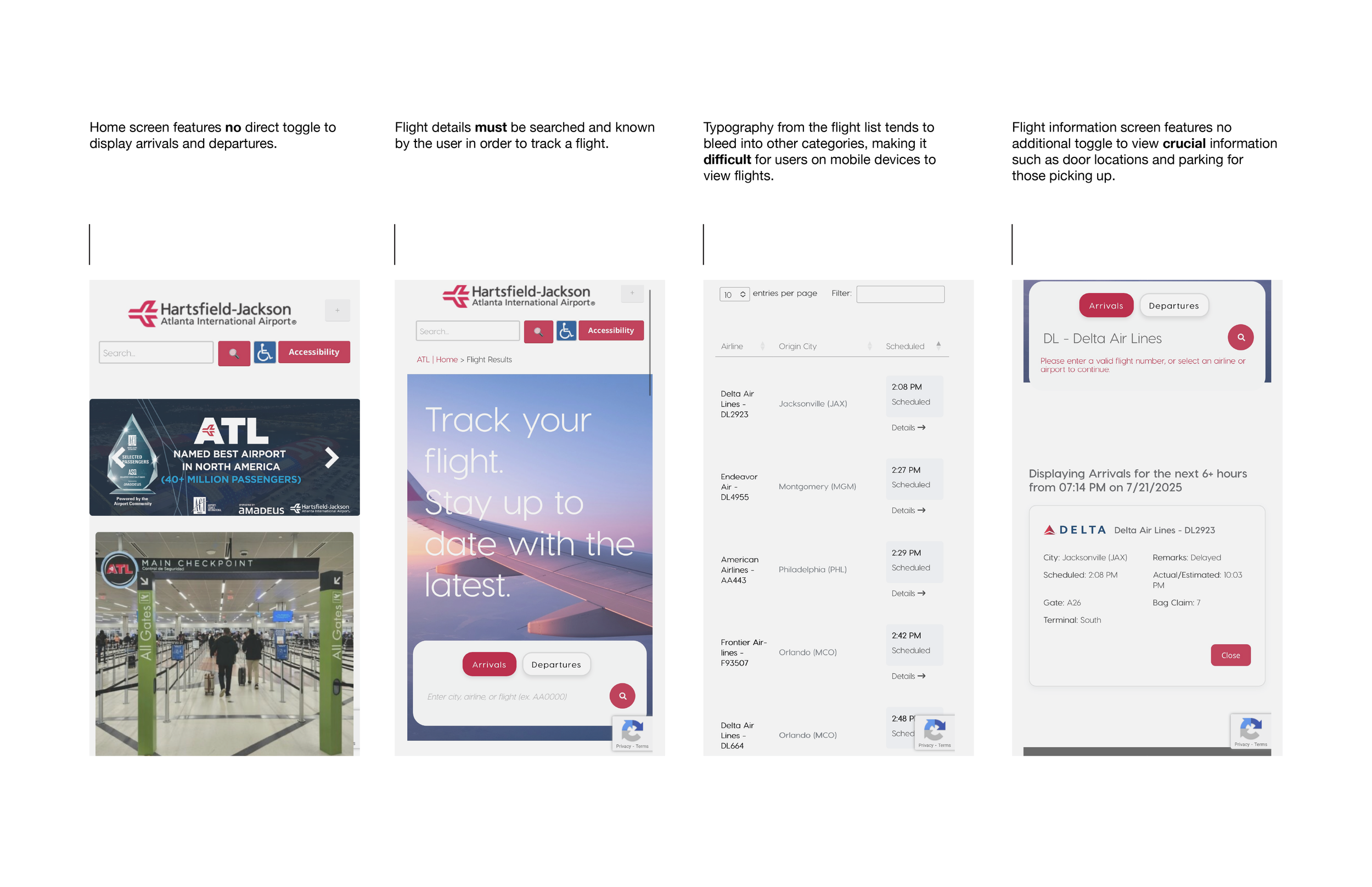
zurich airport
02

users need less clutter and more clarity.
What does this research tell us?
APP ETHOS—
BRAINSTORMING + SKETCHING
Using this app ethos, I began sketching initial interface ideas.


TYPOGRAPHY
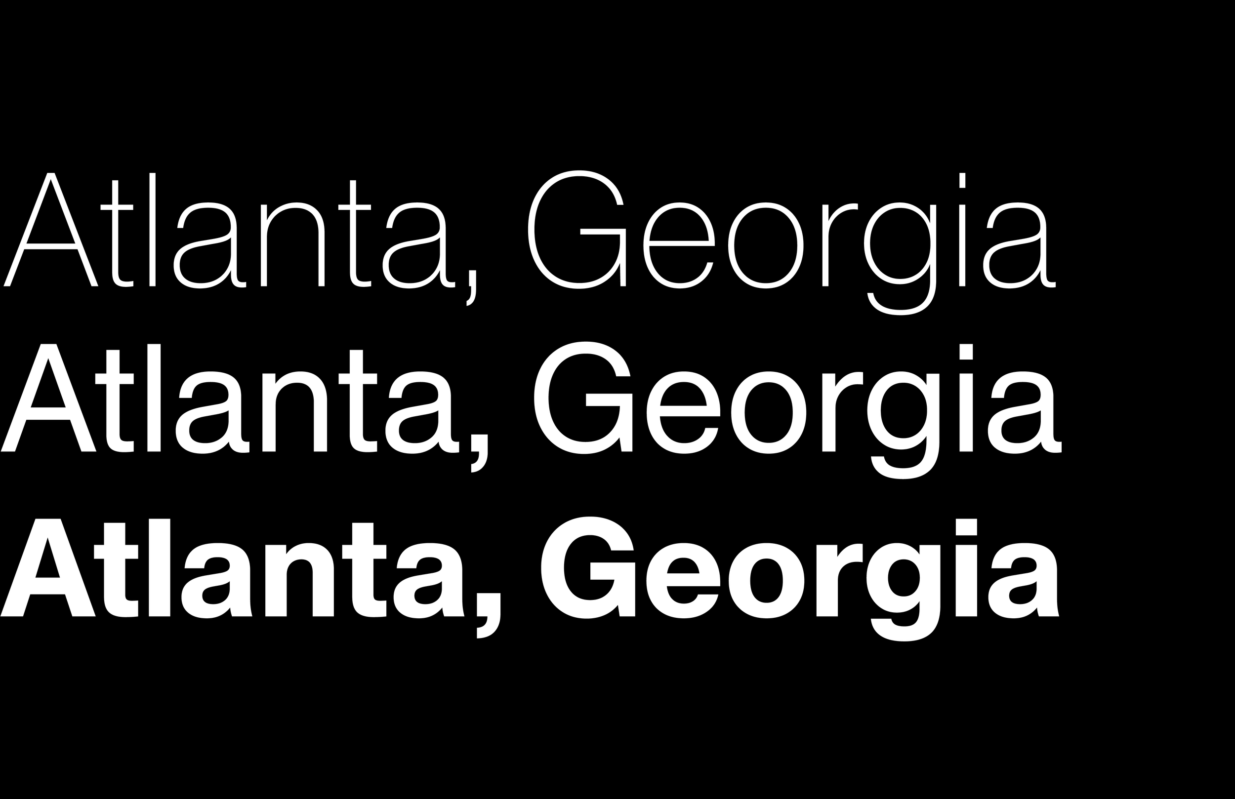
This typeface follows contemporary trends in the world of design. Supporting over 790 languages and variable amongst four axes, Haas Recast blends accessibility with aesthetic tailored to the digital display.

Designing with a typographic grid system is the main theme of this project. Establishing type hierarchy, organizing crucial travel information, and ensuring readability are all vital components.
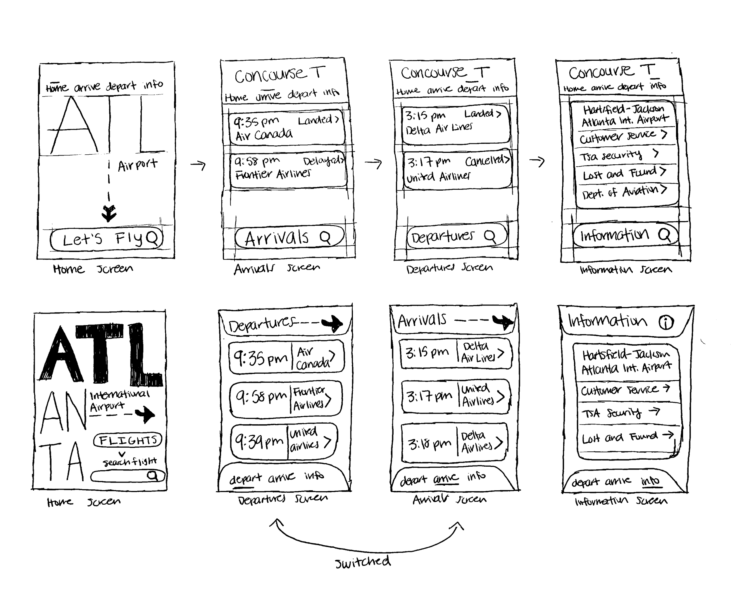
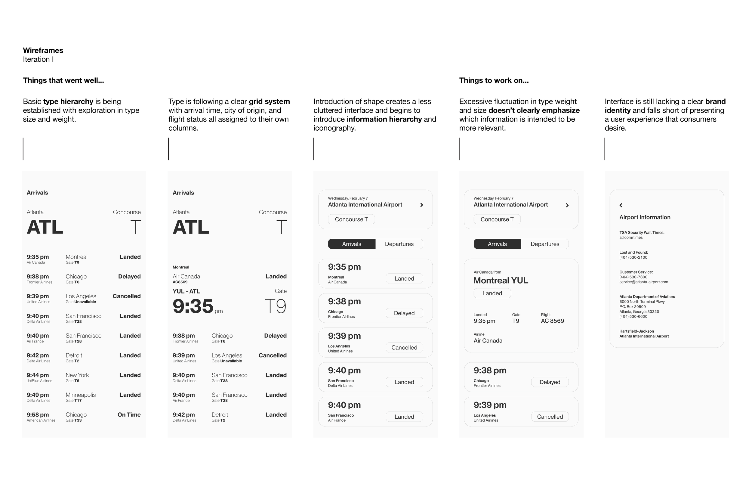
WIREFRAMES ITERATION I
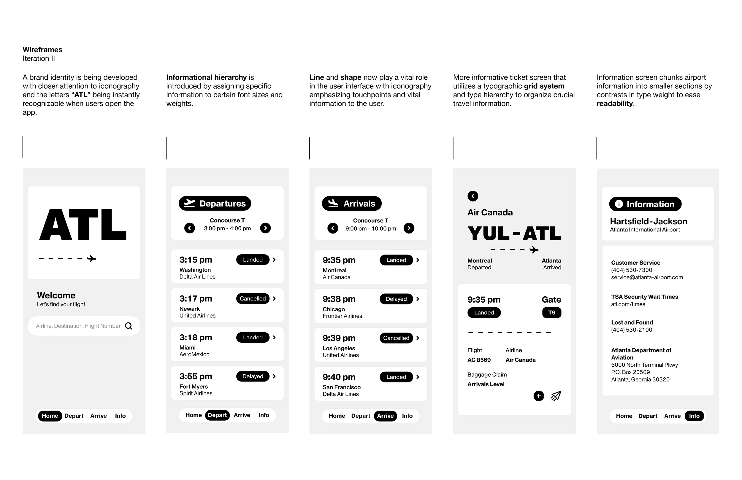
ICONOGRAPHY
Active flights are represented by an upright plane.
Departures are represented by an upward facing plane.
Arrivals are represented by a downward facing plane.
Airport Information features the letter “i” within a circle.
Incorporating the base typographic system and elevating the type hierarchy with the introduction of iconography, further pushes the intuitive UX behind the app.
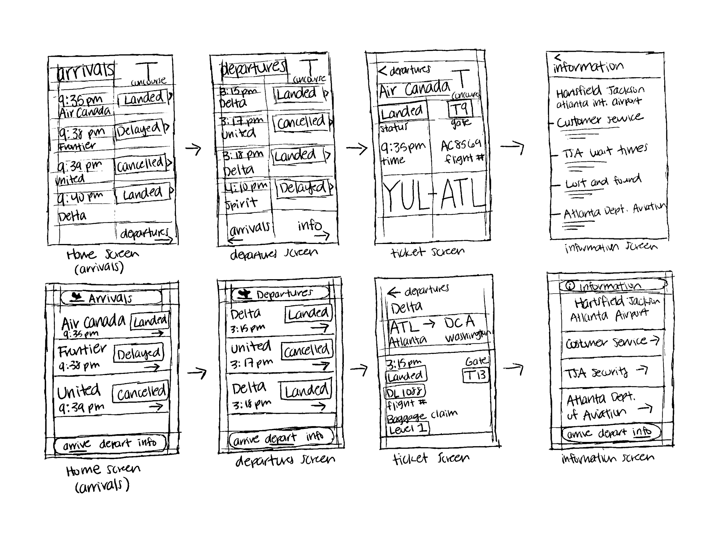
WIREFRAMES ITERATION II
COLORS
PRIMARY:
Atlanta Red
238 66 102
SECONDARY:
Peach Orange
237 157 66
Palm Green
115 193 105
TERTIARY:
Black
0 0 0
Light Gray
240 240 240
White
255 255 255
The colors of this app are crucial to its brand identity. Atlanta Red, featured as the primary color, is notorious for its eye-catching appeal and alertness toward users. Atlanta Red, Peach Orange, and Palm Green are each assigned to representing flight status in order to further differentiate one from the other.
Now with a developing brand identity and typographic system in place, I began to blend color with line and shape to create a unique user-centered app experience.
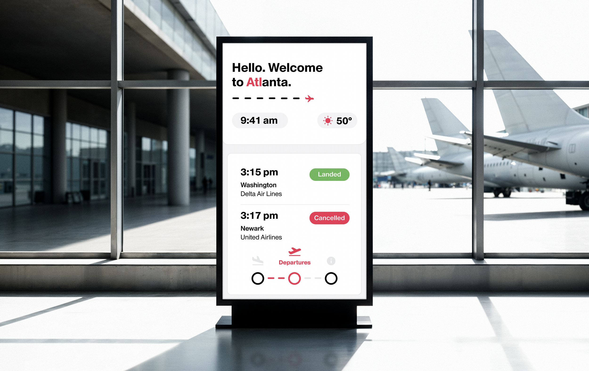
FINAL WIREFRAMES

DESIGNING FURTHER—
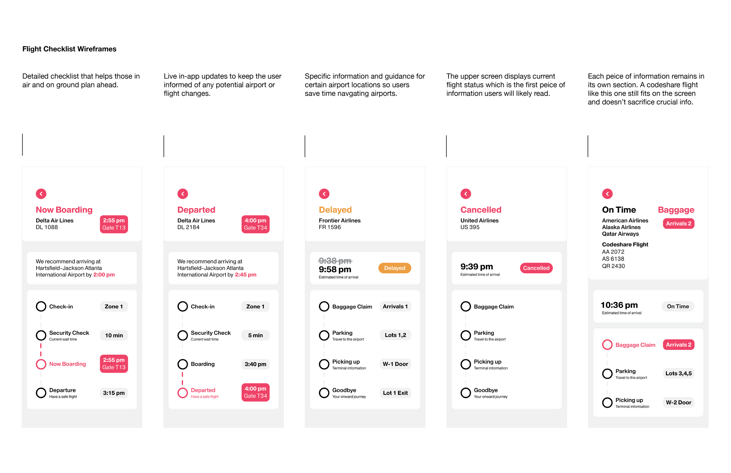
FLIGHT CHECKLIST—Exploring beyond the criteria for this project, I took this app further by designing a flight checklist page displaying real time updates to elevate the user experience.
APP PROTOTYPE
Check out the interactive app built in Figma.