Art. wonder. experience. a branding package.
To develop a branding package that communicates a specific brand identity for a local business in the community. To market a business effectively in order to increase brand recognition.
OBJECTIVE—
A.W.E.—A LOCAL NONPROFIT
I began to research local businesses who needed a fresh look to attract more patrons. Art. Wonder. Experience.—A.W.E.—for short, stuck out to me as a nonprofit in my hometown of Louisville, KY offering free weekly art classes to curious learners in the community.
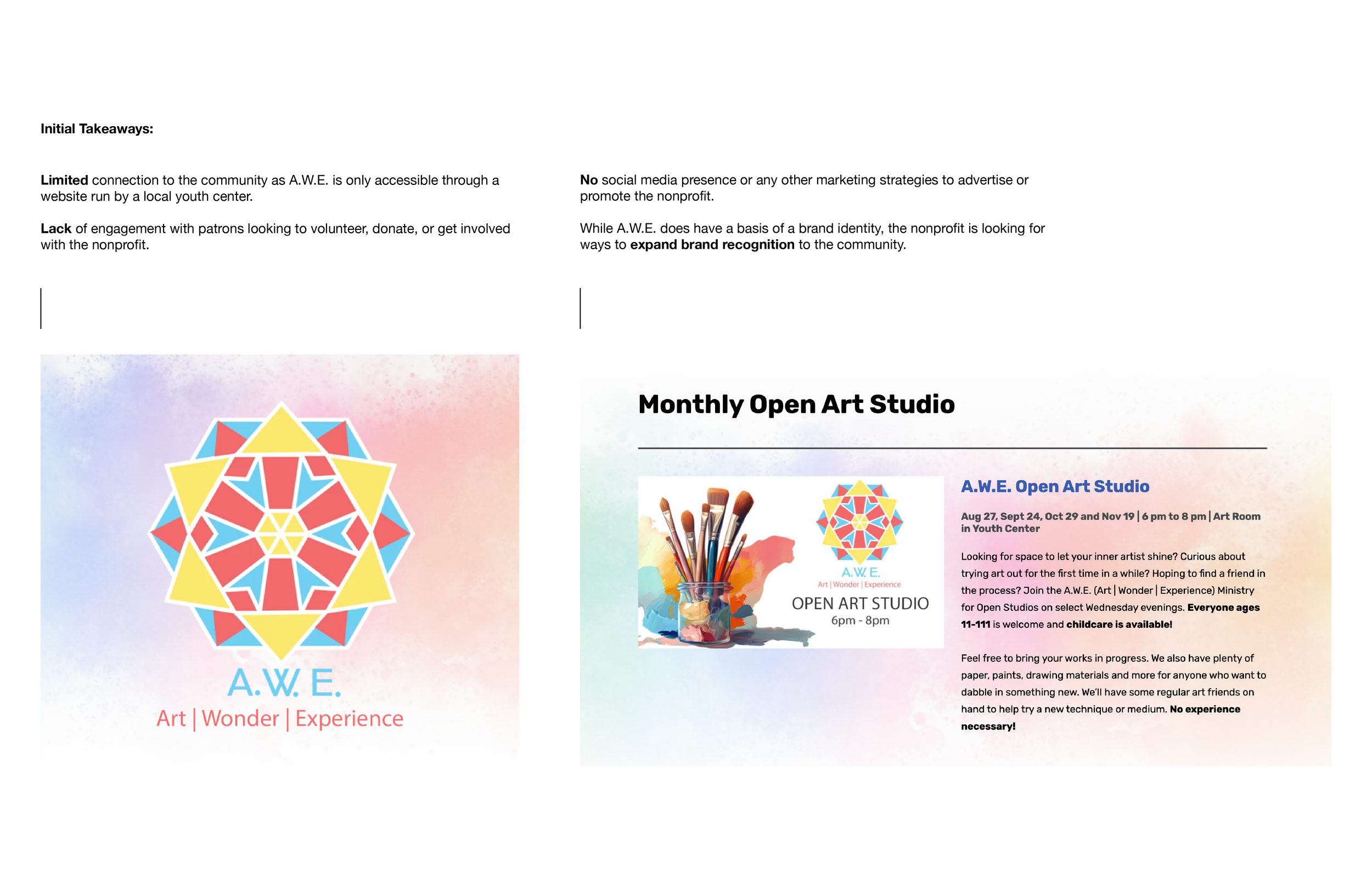
THE BRAND BEFORE
A snapshot of A.W.E.’s current brand identity.
BRAND ETHOS
A.W.E.’s main goal is to create a unifying artistic space for the community at no cost. With this ethos in mind, I began brainstorming a new direction for the nonprofit.
IDEAS TO IMPLEMENT—
Create an instantly recognizable brand through omnichannel marketing strategies.
Design a user centered experience which will increase personal connection and representation within the nonprofit.
Implement accessible advertising to the community from brochures to billboards communicating a clear brand identity.
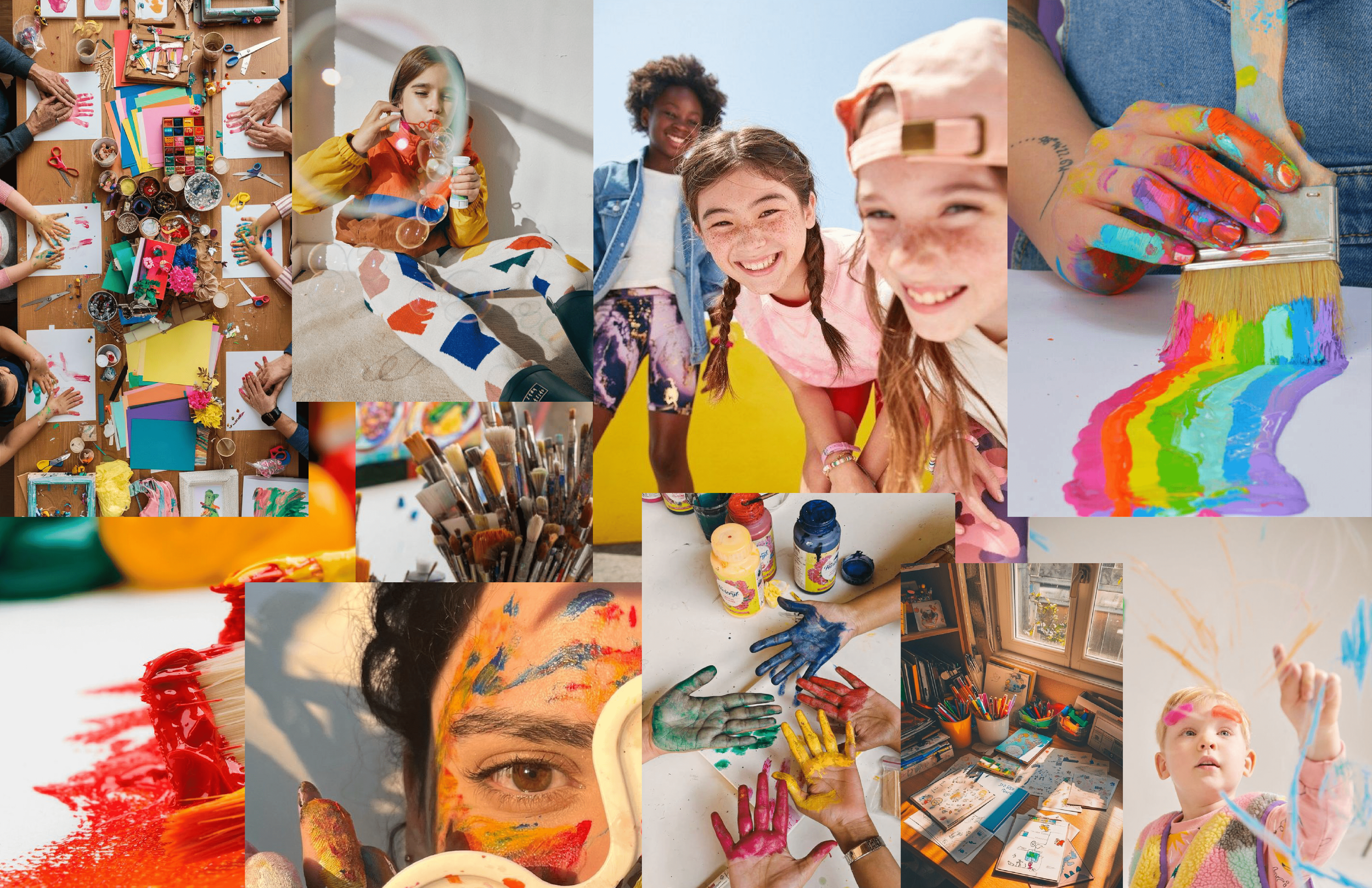
A NEW DIRECTION
Brainstorming and moodboarding a new identity for the brand.

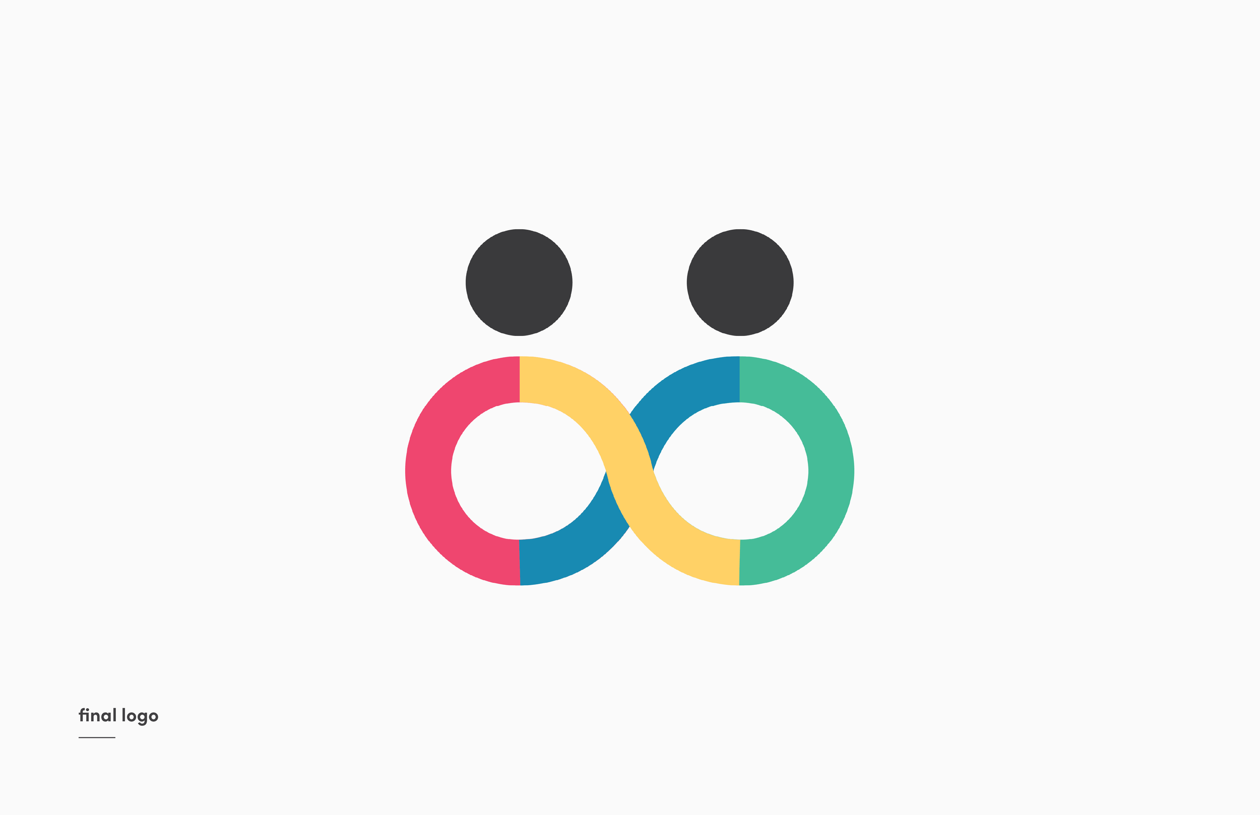
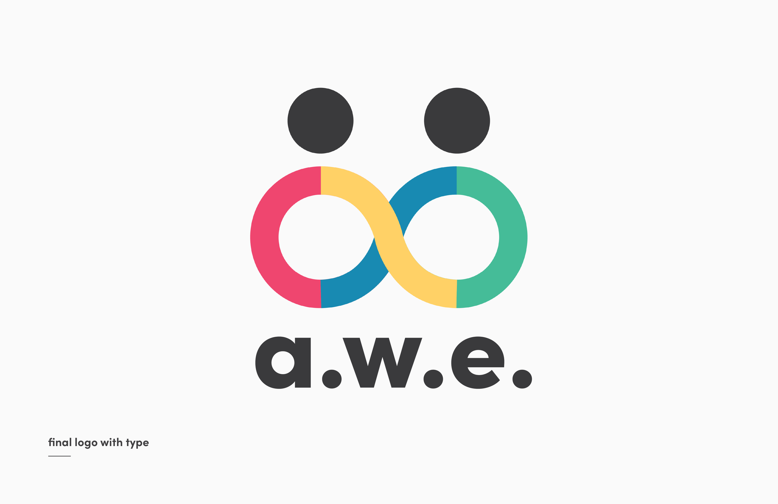
LOGO DESIGN
Designing toward an instantly recognizable logo that communicates A.W.E.’s ethos—unity.

LOGO ANALYSIS
Exploring the purpose of communicating the right logo.
COLORS
239 71 11
Radiant Red
Deep Gold
255 209 102
Lush Green
6 214 160
17 138 178
Cool Blue
Dark Gray
58 58 60
Unity is infinite, not finite. The colors behind A.W.E. reflect the diversity and vibrance of the community. Referencing back to the moodboard, community is associated with bright colors, endless creativity, and a desire to explore. The brands chosen colors are purposeful in igniting minds to think limitless. Like an artists color palette, every color has an equal opportunity in painting a vibrant picture.
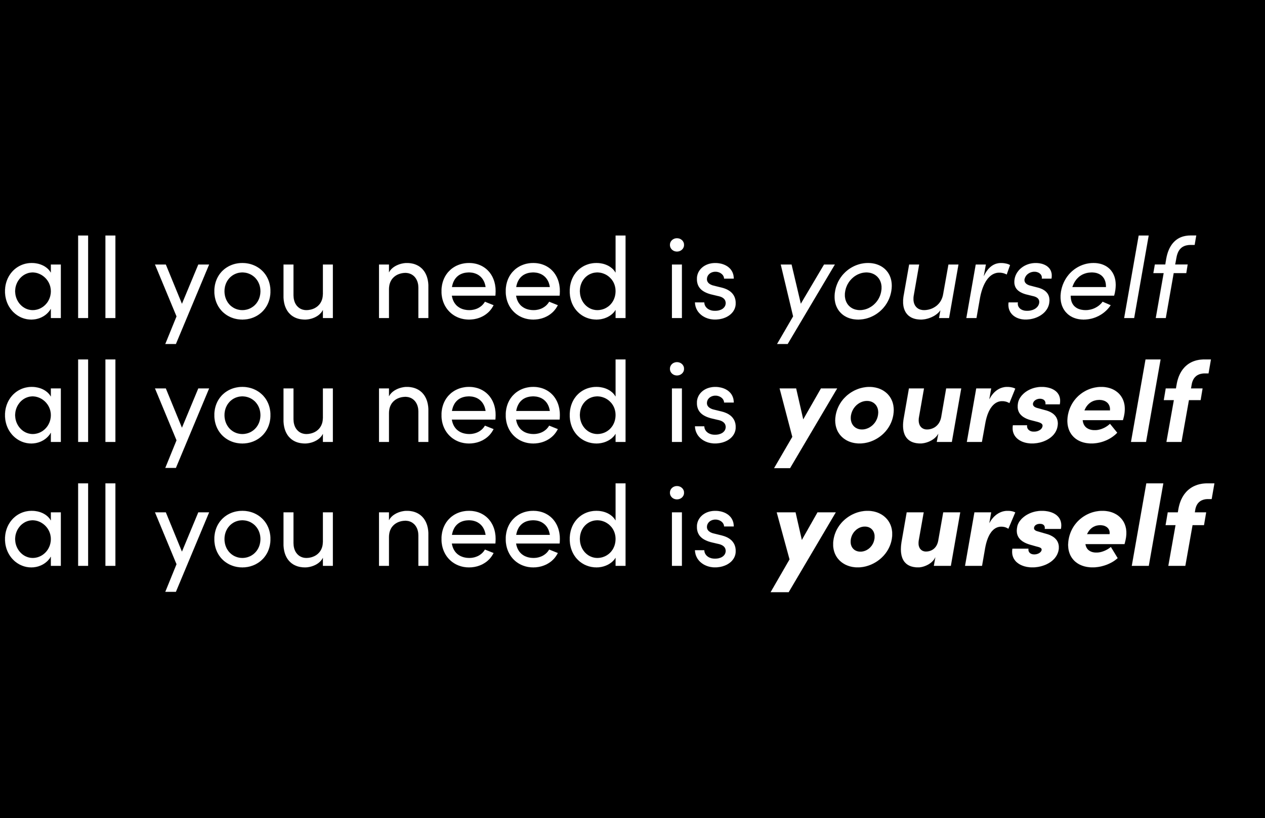
TYPOGRAPHY

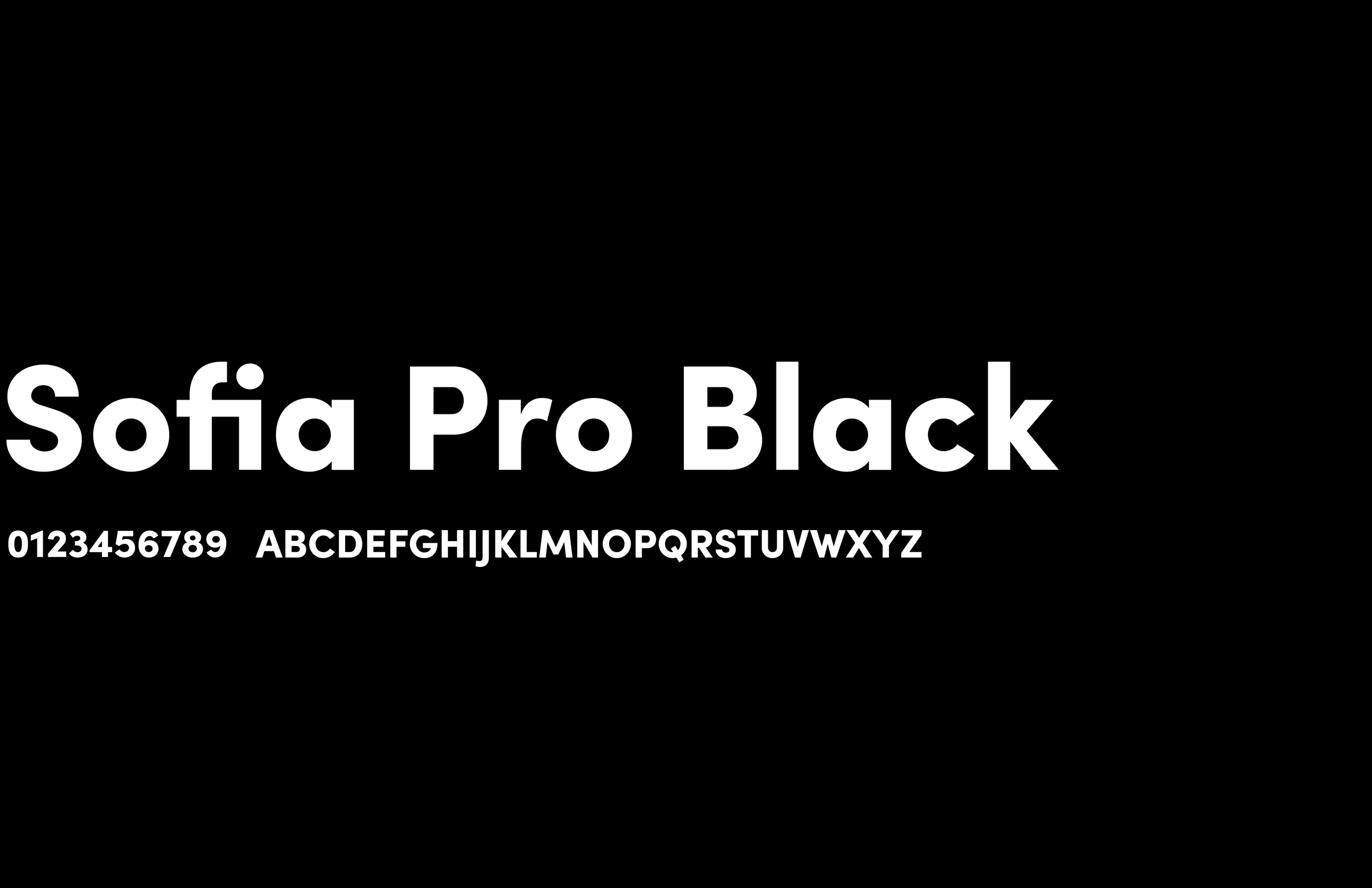
A geometric sans-serif that embodies modern elegance and timeless precision. Sofia Pro stands out in a saturated digital world with its exceptional readability and compatibility with modern media. With its harmonious curves and open space, it creates an invitation to conversation—clear, welcoming, and sophisticated.
THE BRAND AFTER
Now with a reimagined brand identity, target audience, and design system in place, A.W.E. is bringing a new user experience to the market.
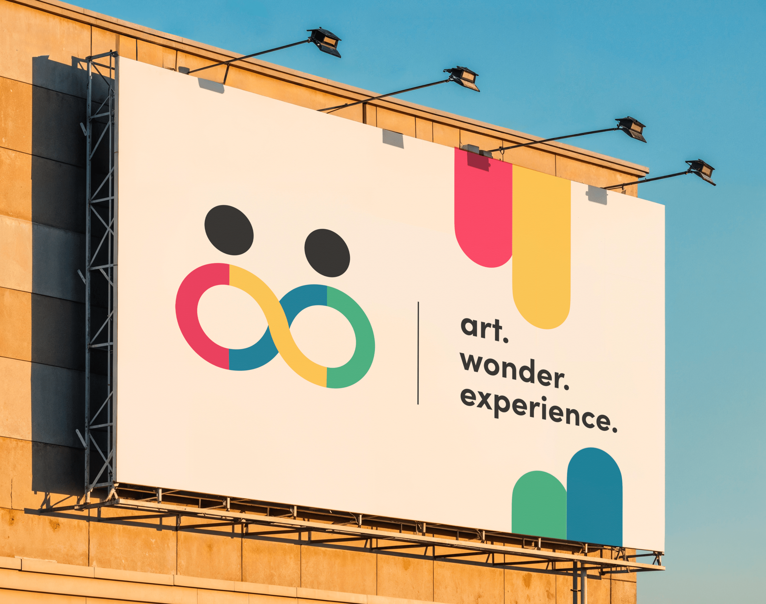
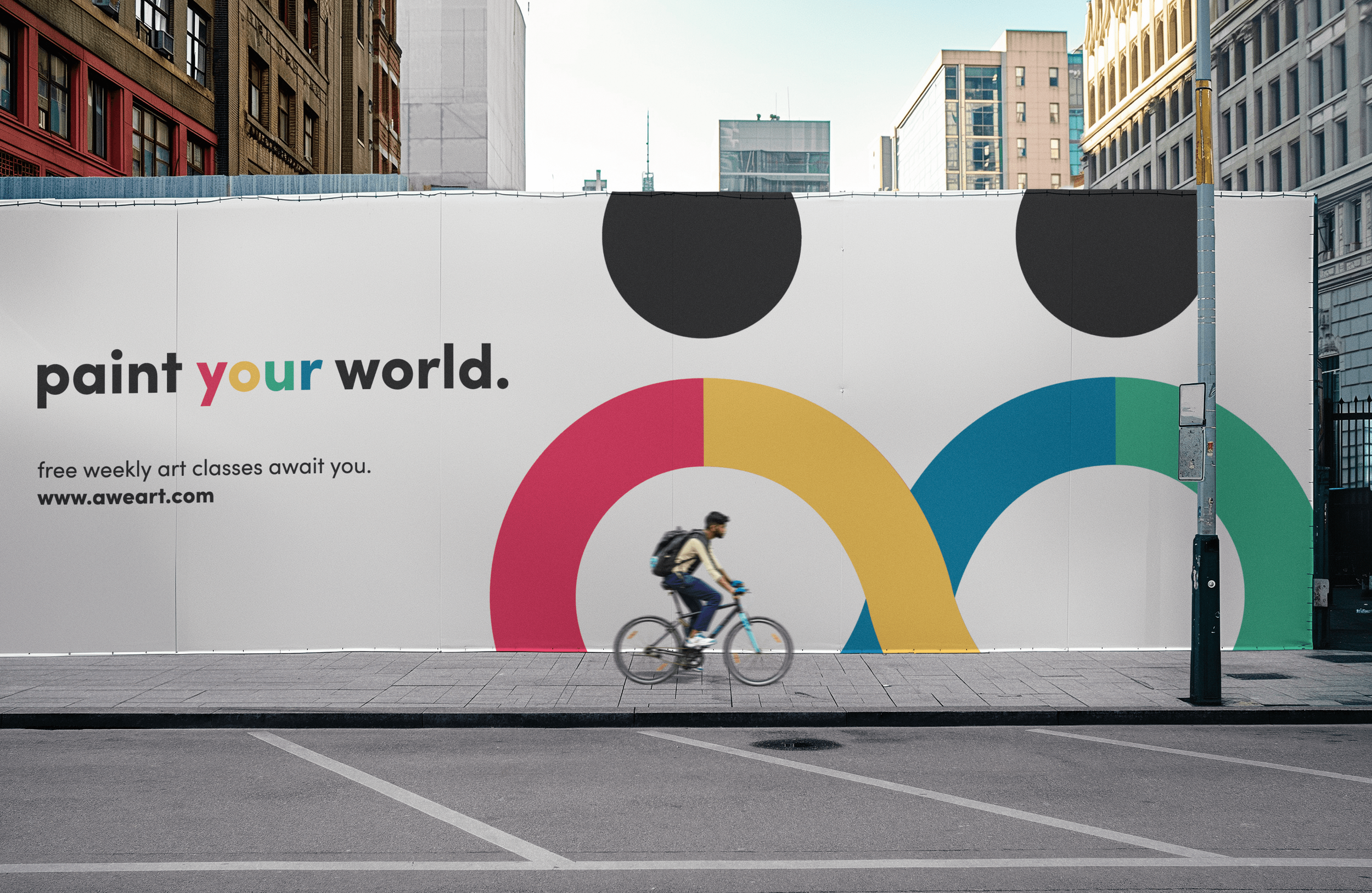
SIGNAGE
Communicating type with image to advertise the brand.


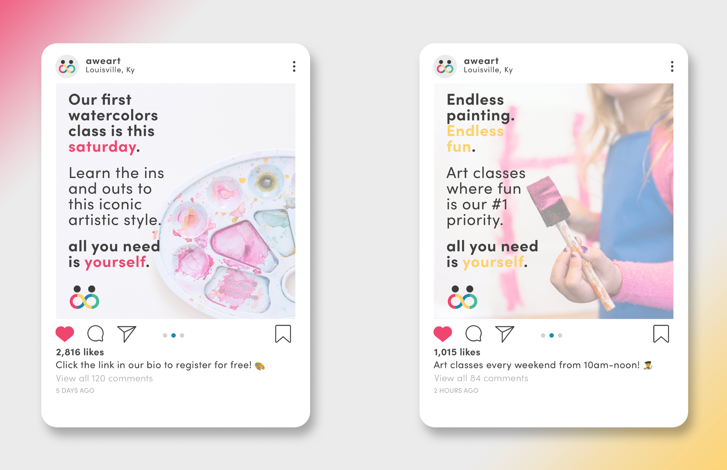
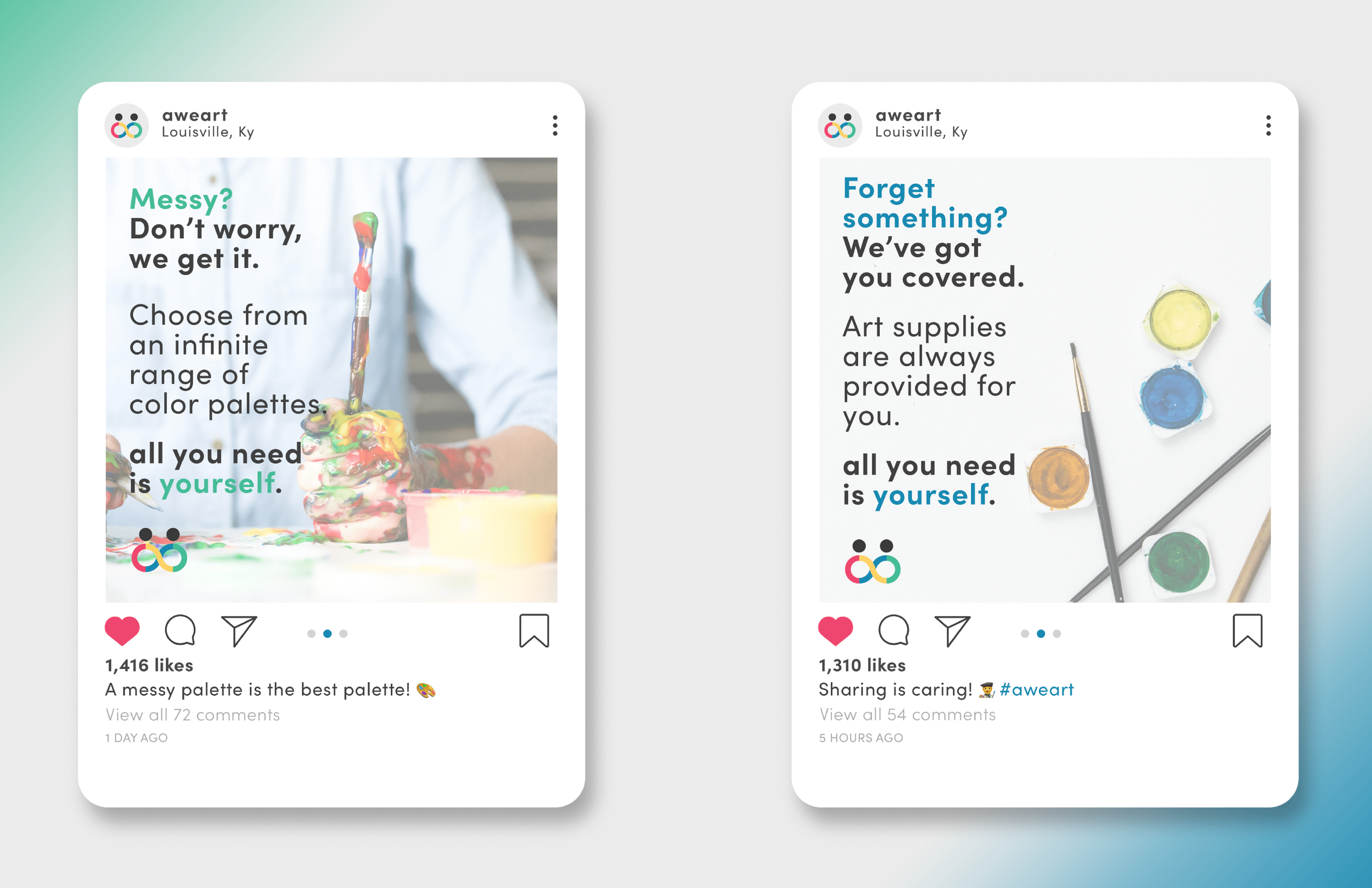
DIGITAL ADVERTISING
Increasing brand recognition through social media.
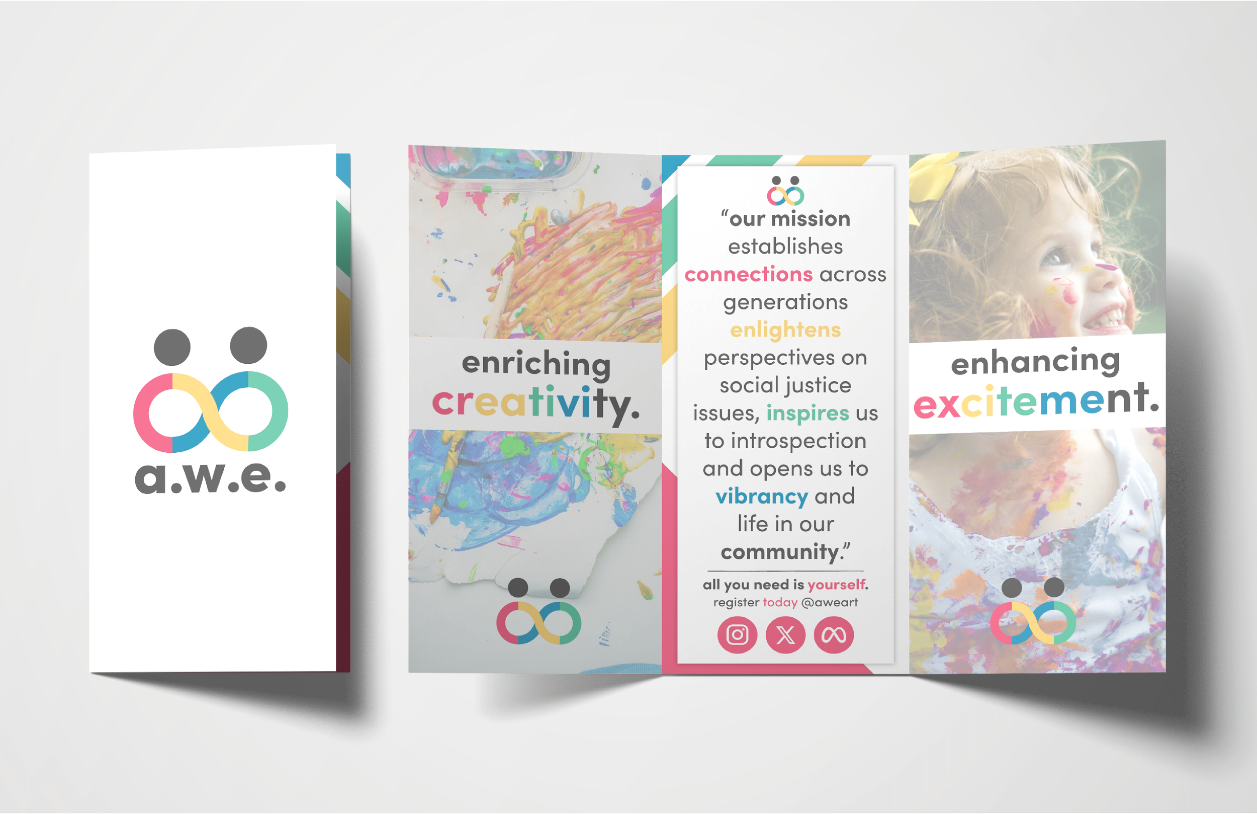
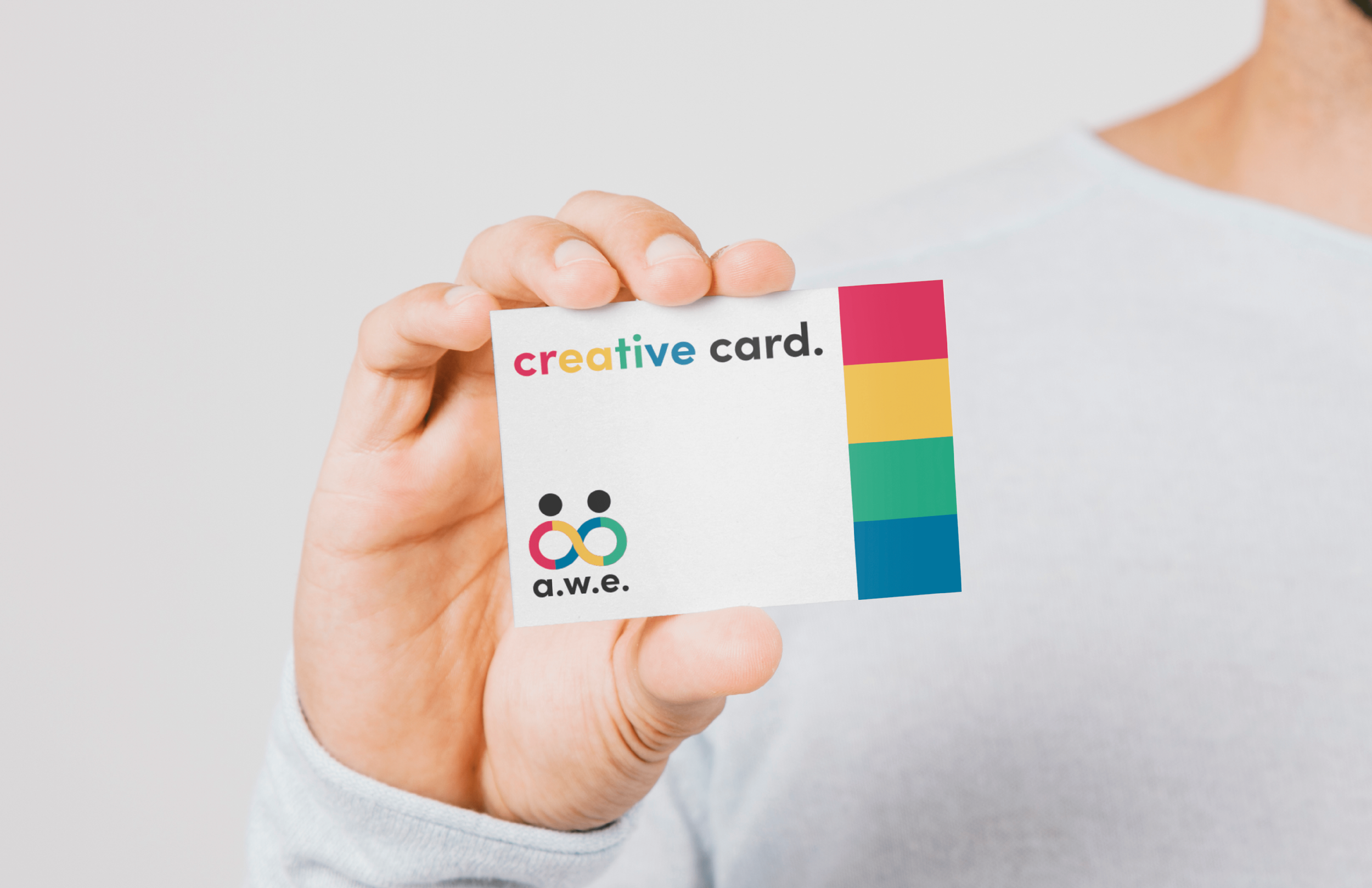
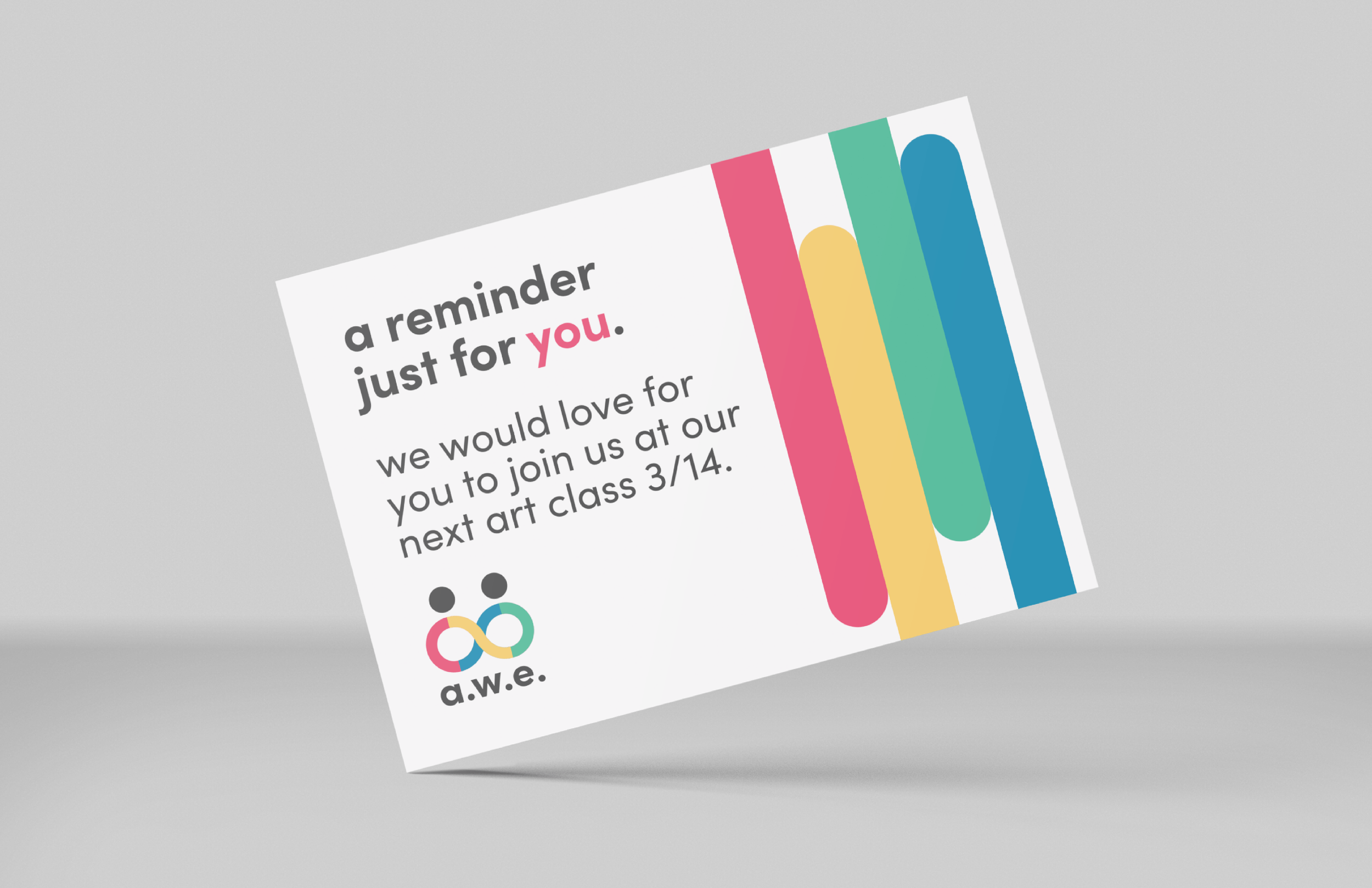
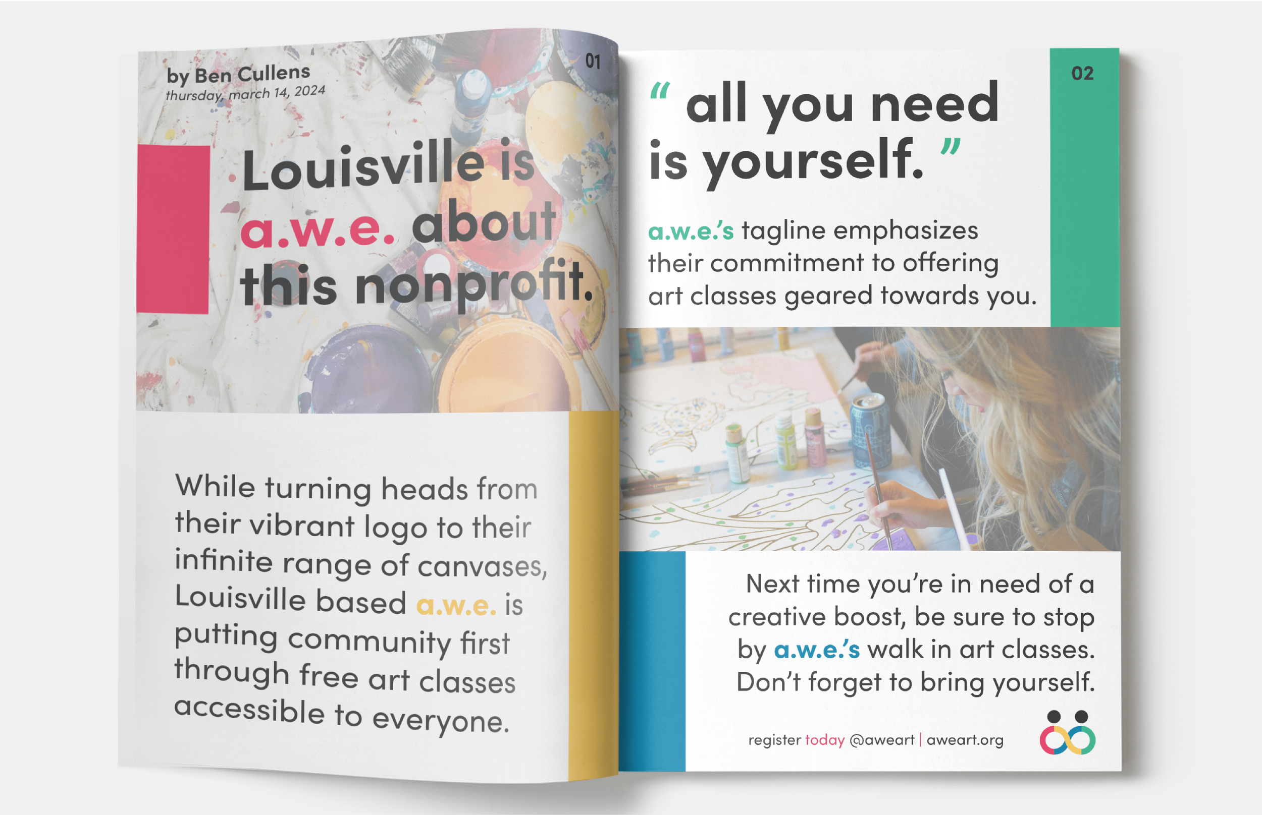
BRAND TOUCHPOINTS
Display of printed media utilized to increase brand loyalty.
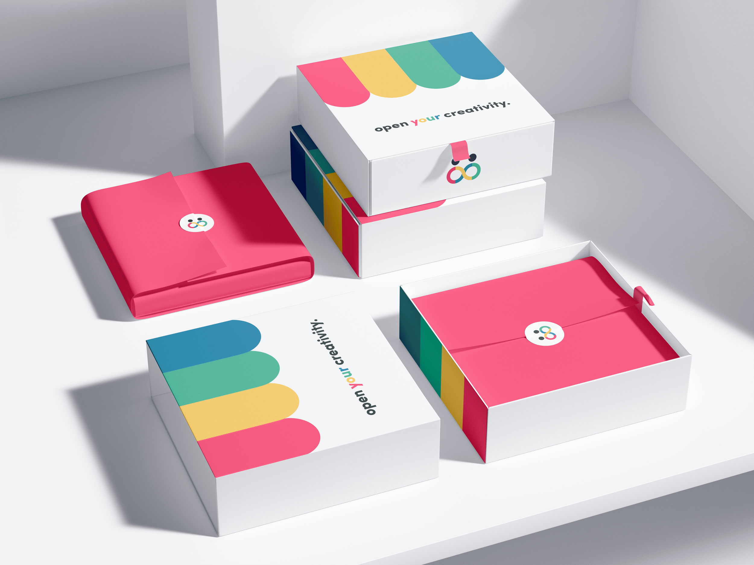
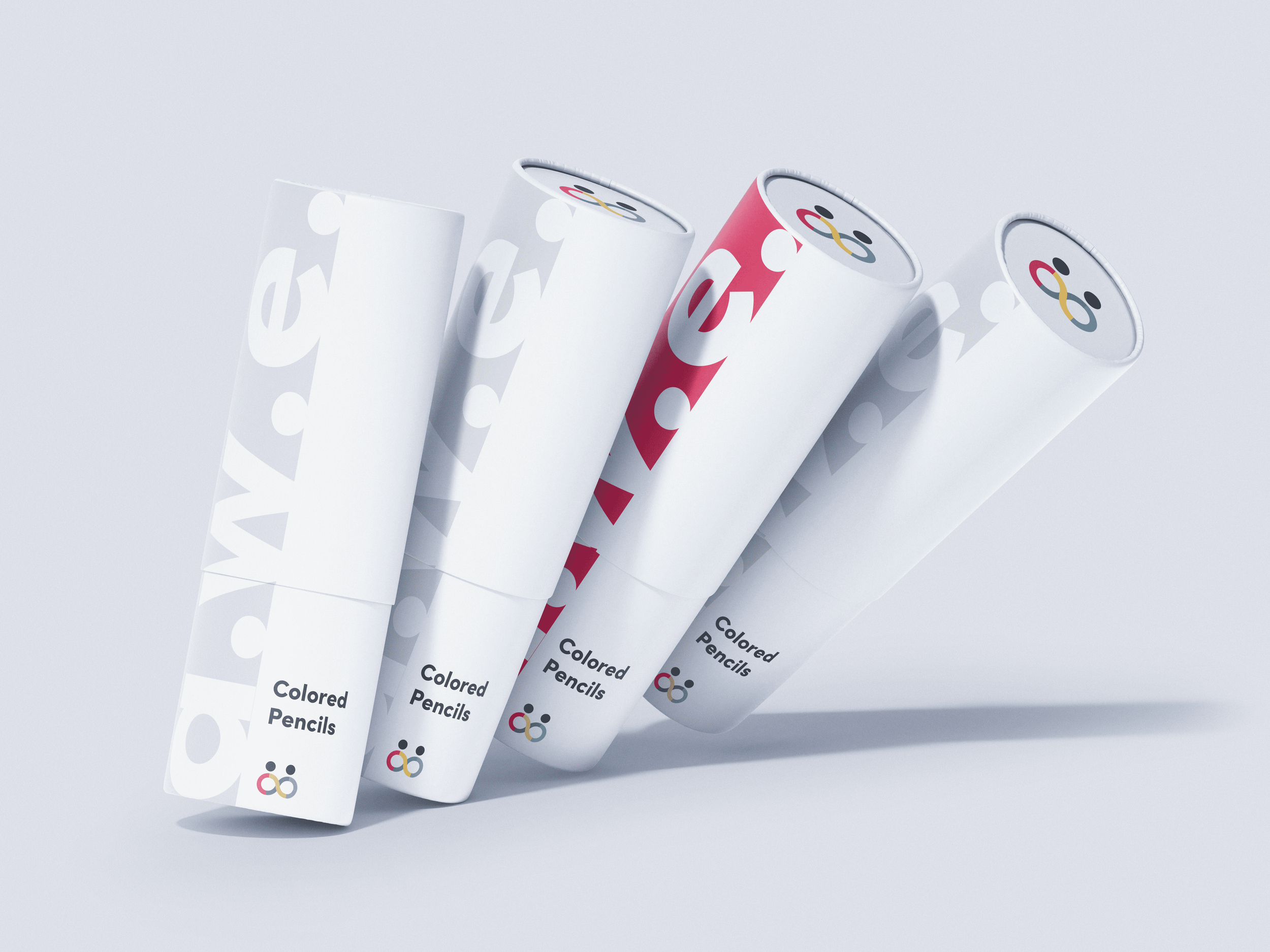
DESIGNING FURTHER—
PACKAGING—Pushing beyond the criteria for this project, I decided to design and develop packaging for A.W.E. The goal of this is to further enhance the user experience by underlining A.W.E.’s ethos—unity—through expanding access to art education outside of the nonprofit with a focus on implementing user-centered packaging.


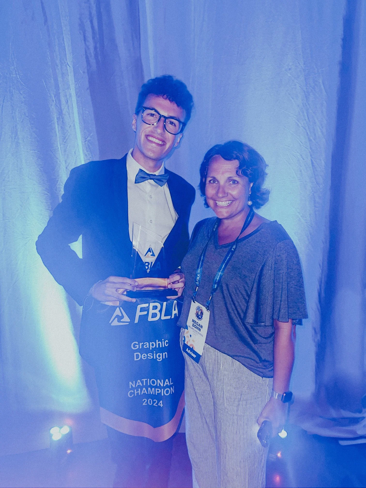
2024 FBLA GRAPHIC DESIGN NATIONAL CHAMPION—
FIRST IN THE NATION—From placing first in FBLA (Future Business Leaders of America) regional, state, and national conferences, I elevated this project from a simple logo redesign into its own branded system.
Up against hundreds of designers from across the nation, I secured a title of national champion for my pitch at cohesively branding, marketing, and selling a business.